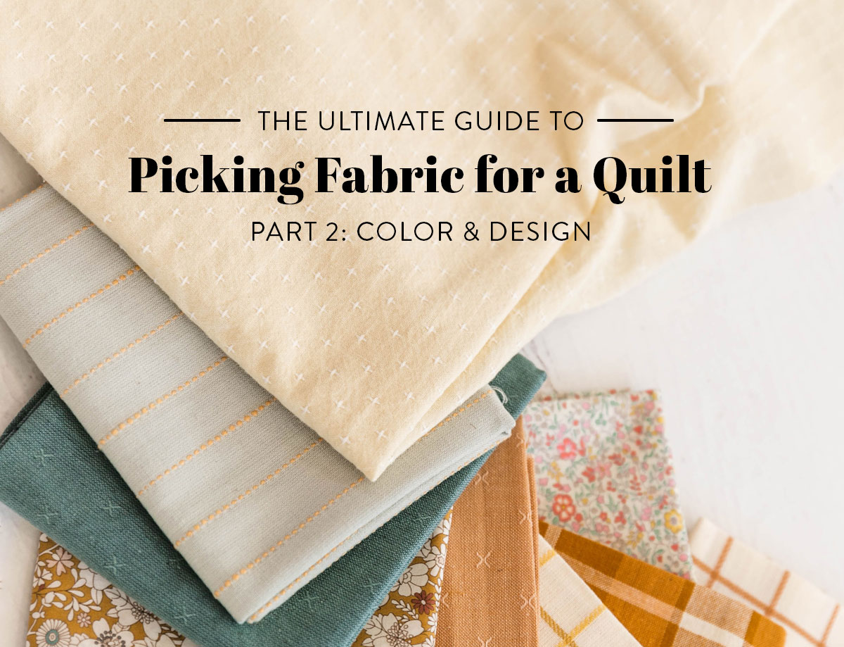
Picking Fabric for a Quilt: Part 2 – Design & Color
Welcome back to the second part in our Ultimate Guide to Picking Fabric for a Quilt. This articles focuses on the nuts and bolts of picking fabric. It might be tempting to skip Picking Fabric for a Quilt Part I: The Creative Process, and jump straight into Part II, but then you'd miss out on all of my hard work in Part 1! (And some important foundational info to this process.)
In the first part of the series we broke down the creative process into three actionable steps. Part 2 will help you understand why you like what you like (Step 1 - Research) and help guide you in picking the right fabrics for your project (Step 2 - Plan).
My number one goal is to help you cultivate confidence in your instincts. Take these compositional elements, internalize them, practice them, then trust yourself. Trust your gut! Sound easy? It really is, but it does take time.
I have boiled down the most common design elements and color theory into clear sections that can be directly applied to picking fabric for a quilt. Right-brainers, there will be no quiz at the end so just sit back and enjoy. Left-brainers, I will personally email you a quiz if you would like to test your new color theory skills. 😉
Design Elements
Concepts we don’t fully understand can appear nebulous and have us feeling like we’re grasping at clouds. Anytime I find myself slipping into that way of thinking it’s a one way ticket to the Land of Overwhelm. Help! Get me off this train!!
Since quilting is supposed to be fun (wink, wink) let’s take the stress and guesswork out of picking fabric. I’m going to break down some elements of design so you can clearly know two things the next time you start a quilt or sewing project:
- Why you like the things you like. We’ve all had this experience of walking into a beautiful boutique and thinking, “THIS! This is totally me. I love everything here!” You feel aesthetically connected. It vibes with you.
- How to replicate those things on your own terms. That shop owner is not a magical design wizard. They have spent time honing their personal aesthetic to a point where they know how to curate a shop full of cohesive things. You will get to this same place when picking fabric for your quits.
Sound good? Let’s cannonball right in!
Foreground vs. Background
Foreground is the most prominent feature in a quilt and Background is the secondary space or “negative” space that allows the Foreground to shine. Once you have picked a quilt pattern ask yourself, “Is there a clear Foreground and Background?”
Some quilt patterns make this really easy and even list Background fabric in the requirements. Here are some examples of quilts with a clearly defined Foreground and Background.

This Adventureland quilt uses light cream fabric as the Background so it recedes behind the bright Foreground strips.

The Background is the darkest fabric in this Holiday Party quilt making the lighter Foreground fabrics glow like a lamp in a dark room.

Here are two different examples of the same pattern, Mod Mountains. One uses a dark lightweight denim as the Background. The Foreground is light and bright linen.
The second quilt scraps together light beige fabric as the Background. It can be tricky to keep scraps of different fabric as the Background, because by nature our eyes seek out order and find the differences. To maintain that clear Background, and make sure the Foreground is still getting all of the attention, this quilt uses only solid or blender fabric as the Background. The prints and bright colors are reserved for the Foreground. (More on prints, solids and blender fabrics below.)

Background vs. Foreground takeaways:
- The Background fabric does not need to be a light color, but remember that its purpose is to support the Foreground.
- The Background fabric does not need to be one continuous solid fabric. You can use as many scraps as you like as long as you keep in mind that they need to be similar enough to not attract more attention than the Foreground.
Contrast
Once you have established if there is a clear Foreground and Background you now have another choice to make — how much Contrast do you want between the two? If there is no obvious Foreground and Background, you can still create Contrast among all of the parts in your quilt.
This Christmas-inspired Maypole quilt is a good example of a design having no clear Foreground and Background, but through fabric choices the parts of the quilt are still clearly visible.

The more Contrast in your quilt, the more difference there is between the parts. High-Contrast quilts are bold and clearly show off the quilt pattern while Low-Contrast quilts have a blended, watercolor effect. Especially in the beginning while you are honing this skill, I suggest you pick one or the other for each quilt — high, medium or low Contrast.
Below are three quilts all made from the same Glitter & Glow pattern, however they look vastly different because of the amount of Contrast among their parts.
Low Contrast

Medium Contrast
Because the colors are bright and perky your mind might be telling you that it's a highly contrasting quilt; however, if you compare the parts of the quilt, there really isn't a huge difference between them.

High Contrast

During the planning step in your creative process, consciously choose the “vibe” of your quilt. This will help you make all of your fabric decisions. Pick an adjective that you want to describe. Some words I’ve used in the past are: Mellow, Jubilant, Minimal, Youthful, and Sophisticated.
Here are some examples of the Shining Star quilt pattern and how Contrast can portray their vibe.
High Contrast - Minimal Bold

Medium Contrast - Happy and Calm

High Contrast - Youthful

Contrast is not just the juxtaposition between light and dark (or what we will call Value.) Oooh no. The exciting thing about Contrast is that it can be achieved through any of our next four elements — Value, Hue, Saturation, and Scale.
Let’s look at this Bohemian Garden baby quilt. The adjective I assigned to it is Jubilant, so I wanted it to be highly contrasting and give the feeling of movement and vibration. If you make the photo of this quilt grayscale, it actually looks like it has very little Contrast.


That’s because I achieved Contrast between the Background and Foreground by incorporating not just one, but all three of our next elements — Hue, Value, and Saturation.
Hue, Value, & Saturation
Woah, woah, woah, slow down! Suz, you’re jumping a little fast. Can we take this one term at a time?
This may seem like a leap, but I want to throw you into this trifecta all at once because these three elements — Hue, Value, and Saturation, work best in tandem. I could break each one down into its own detailed section, but honestly I think seeing examples of how they work in a quilt is the best way to internalize them.
Because remember, the goal of this guide to picking fabric is to make these design elements become second nature so you can start trusting your creative instincts. Creative confidence is the name of the game! I want you to be able to look at a fabric pull and say, “hmmm…something is off with that fabric. Ah HA! It’s the Saturation. It’s way too bright and is creating too much Contrast.”
So let’s break it down:
- Hue: a fancy name for color
- Value: the lightness or darkness of a color
- Saturation: the intensity of a color
The fabrics you choose are on a sliding scale of all three of these things. Using fabrics that are in varying places on these three scales is how you can create Contrast. If you want a Low-Contrast quilt, pick fabrics that are all on the same side of the Hue/Value/Saturation scale. If you want high Contrast, jump around the scale to create variety and the appearance of depth.

Hue - the color
This rainbow bundle of fabric is the same Saturation and the same Value, but it still brings the Contrast. How? A wide range of Hues. We're covering the entire color wheel in this bundle!

Value - the lightness or darkness
These fabrics are all red in Hue, but range from dark to light in Value. That range in value would make this fabric a highly Contrasting quilt.

Saturation - the intensity
These fabrics are all the same Hue, and roughly the same Value, but range drastically in Saturation. That range in saturation brings lots of Contrast.
I can tell this is sinking in, so let's look at more quilt examples to solidify these design elements.
These next two examples are both Reflections quilts. They both use fabrics with minimal variation in Hue, so one might think with that fact alone, they are both low in Contrast. Let's take a deeper look to see.

Reflections #1: Medium Contrast
- Variation in Hue: low
- Variation in Value: medium
- Variation in Saturation: low
I'm on the fence about calling this low or medium in Contrast. The main takeaway is that when these three design elements are low in variation, you're going to have a lower Contrast quilt and with that the overall vibe of the quilt will be quieter and feel more calm.

Reflections #2: High Contrast
- Variation in Hue: low
- Variation in Value: high
- Variation in Saturation: low
The Saturation variation is low because it's all high. 😉 That sounds contradicting, but if you look at the colors at play, every fabric is pulling in either bright blue or white. So while our Saturation is bright, the variation in Saturation is low.
This pillow is still high in Contrast, however, because it has a lot of range between lightness and darkness — meaning its Value variation is high. So if I replaced all of the light fabric with more bright blue fabric, this pillow would be extremely low in Contrast even though it's using highly saturated blues.
But let's jump back to that Bohemian Garden quilt for a second. That quilt has lots of contrast even though the Value of some of those fabrics is the same. The Contrast in that quilt comes from the range in Saturation (look at the muted green compared to the bright red) and the range in Hue (those colors are all over the place!)


New Horizons #1: Medium Contrast
- Variation in Hue: high (every fabric is a different color)
- Variation in Value: medium (aside from the Background, all of the Foreground fabric is the same Value, which isn't a massive jump from the Background)
- Variation in Saturation: low (these fabrics are all of a medium Saturation, so the variation between them is low)

New Horizons #2: High Contrast
- Variation in Hue: medium (aside from the Background, all of the fabrics are in the pink/orange range)
- Variation in Value: high (there is a huge range in Value between the dark pink and the light taupe Background fabric)
- Variation in Saturation: medium (the background is very muted, however all of the Foreground fabric is of the same saturation)
Scale
When applying the design element of Scale to fabric we are referring to the size of the printed or woven pattern. For ease, when talking about the size or scale of a fabric pattern I’ll refer to them simply as large, medium, and small.

The Scale of a print can play into whether that fabric is considered a "hero" or a "blender" fabric.
- Hero fabric, as you may have guessed, is the showstopper in your quilt. It’s the Herculean print breaking through the crowd and catching everyone’s eye. Many times this hero fabric is a large-scale print or high in Contrast.
- Blender fabric is the audience watching and cheering for the hero fabric. These blenders are a slight step away from solid fabric. In fact, if you squint your eyes, you may not even be able to tell they are a print at all. Usually blender fabric is either a small-scale print or very low in Contrast.
Below are two examples of hero and blender fabrics using the same quilt pattern, Sugar POP. In the blue quilt the hero fabric is actually not darkest in Hue, Saturation or Value. It is the showstopper by being a busy large-scale print. Don't you love this Liberty of London fabric? It's many years old and I believe it's out of print, but maybe somewhere you can still find remnants of it.
The blender companion fabrics include a couple stripes, a teeny tiny dot print, and a lightweight denim.

This next Sugar POP has a very obvious hero fabric. That Kokka floral is such a statement that at the time I decided to use only solids with it.
If I were to make this quilt over again I would add some supporting blender prints. The harsh juxtaposition of this large-scale print with only solids is more Contrast than I like. That fabric is now the only thing I see when I look at this quilt! Some blender prints would take the focus from it and ease its transition into the neighboring strips, creating more of a cohesive flow.

Print or woven scale is the final thing to consider when picking fabric for a quilt, and, to tell you the truth, I think it can be the trickiest element. Because of that, you can choose to leave prints out of your quilt all together or stick to using only blender fabric. You really can make beautiful quilts with solid fabrics if you don’t want to mess with Scale.
However, nicely placed prints can add tons of interest and personality to a quit. Once you feel confident using solids, try dipping your toe into prints using these hero and blender fabric tips.
Hero/Blender Fabric Tip!
Are you feeling a little confused by hero and blender fabrics? Here's an easy trick — find a hero fabric you love and then use it as the backing. Heck! Use it as the binding too. In your pieced quilt top, coordinate blenders and solid fabrics with the backing.

This way you know for sure you won't have competing prints and the quilt will look cohesive from front to back. Above is the Modern Fans quilt pattern and below is Starling.

Color Theory
Are you feeling like a design pro? It’s OK if you’re not. This stuff takes time. Fun fact: Leo da Vinci didn’t even start painting the Mona Lisa until he was 51. At that time he’d been professionally training as a painter for over 30 years!
It’s hard to talk about Color Theory without bringing up the color wheel. I personally don't think much about the color wheel because it can sometimes make me feel boxed in and feel unhelpful. I will say, however, it is a good foundation and will help grow your creative confidence. So let’s talk about it, internalize it, then not think too much about it.

The Color Wheel
The color wheel is helpful if you are feeling totally lost and just need a road map; however, like a lot of maps, it can also make you feel more lost. I suggest using the color wheel and its color harmonies loosely. Look at it and then put it away.

Monochromatic
This color harmony is a single slice of color wheel pie. My monochromatic green Fireside quilt uses medium to low Saturation colors in light to medium Value.
I sprinkled in a few low Saturation and low Value prints that range from small to medium Scale. Some of those prints (I'm looking at you dots and stripes) are blender fabrics and very closely read as solids. When pulling fabric for this quilt I wanted to make sure the cream Background supported the green Foreground even though prints are usually more eye-catching than solids.

Monochromatic quilts have a simple and sophisticated look. These quilts can use one fabric or many fabrics of the same Hue. Below are some Voyage quilt examples.


Below is a Monochromatic Maypole quilt that brings Contrast through Saturation, Value, and Scale.

Since this Luminous quilt mock-up uses shades of green along with other neutrals, I consider it Monochromatic. The last fabric, Peach Sherbet, is pushing the neutral limit. The addition of a slightly Complementary color in low Saturation and Low Value adds a lot of sophistication and visual interest.
So, I'll let you decide, should we let this stay in the Monochromatic category? Or should we bump it down into our next color harmony?

Monochromatic Fabric Pulls
A couple things to note about Monochromatic fabric pulls — each fabric does not need to be exclusively one color. The overall look of the fabric just needs to read as that color. Take the plaid fabric in the bottom left corner, for example. It has pops of sienna, but still reads as a blue plaid.
These small breaks from the main color can add subtle interest to a quilt, making it have more depth and feel even more textured.


The reason this green Fireside quilt looks so striking next to a blanket of red leaves brings me to our next color harmony.

Complementary
Are you a sports fan? I'm not, but I'm around enough of them to know that if you want a loud color combination that grabs an audience's attention, pick highly saturated Complementary colors. No doubt, that combo will bring the energy!
Complementary hues are opposites on the color wheel. These colors work well together because they bring balance. Here's an example of a blue and orange Triangle Jitters dog bed. Do you notice that even with lower Saturation blues and orange it's quite bold? You have to really turn down the Saturation and Value to make a Complementary combo read as low key.

Here's where I suggest we deviate a bit from the color wheel. Use the term "Complementary" broadly. Take for example this Triangle Jitters throw quilt. Pure orange and blue would not have given me the modern look I wanted as this gold and turquoise combination.


This Luminous mock-up takes those same turquoise and gold Hues and expands on them with more supporting shades. This addition of color adds depth, sophistication, and makes a quilt sing!


Of course I would be remiss to not mention red and green Christmas quilts in this category. You know they will be filled with energy and cheer! Here's a Kris Kross Christmas throw quilt...

This next Lumimous mock-up isn't technically Complementary, but it's close enough that you get some beautiful contrast. Making it slightly off from true Complementary colors gives it added sophistication. After picking the two main Hues, tie the fabric pull together by adding transitional, supporting fabrics in different shades of the two main Hues.


Analogous
Analogous color harmonies use 2-4 colors next to each other on the color wheel. Think of this fabric combo like a slightly more complex Monochromatic harmony.
This Hexie Stripe quilt could be tossed into the Monochromatic category and nobody would think twice; however, if your look more closely there's blue/lavender and magenta next to that fantastic periwinkle.


This Analogous Maypole uses lower Saturation Hues of orange/gold and lavender/mauve.


This Luminous quilt mock-up uses a photo of flowers as color inspiration to pull Hues from almost one whole side of the color wheel. I think we can loosely throw this into the Analogous category.


Split Complementary
This is going to be the final color harmony we go over because the last thing I want is this article to feel overwhelmingly large. Like I mentioned before, it's good to know the science behind colors and how they can work together, but I don't want you to feel chained to the color wheel.
In this example you can see how this fabric pull can loosely fit in the Split Complementary category, but not completely. Technically Split Complementary is just like Complementary except one of the colors splits — making this color harmony more subtle than your highly Contrasting red and green Christmas quilt.

The color wheel on the left shoes a true Split Complementary. The one on the right shows what I did in the Garland quilt below.


The color wheel on the left shows a true Split Complementary. The one on the right shows the fabrics in the Fireside quilt below.

The main takeaway in Color Theory is that there are reasons some Hues flow really gently together and create subtle contrast, while others vibrate against each other or even create undesirable dissonance.
If at any point your gut is telling you the fabrics you picked are just not looking quite right, I want you to go through a simple checklist to figure out why:
- Is the Background supporting the Foreground so it can be the main focus?
- Am I achieving the desired amount of Contrast through Hue, Value, Saturation, and Scale?
- Am I amplifying the vibe of my quilt through color harmony?
And that's it! Try not to overthink it and let your gut be your guide. You can ask for second opinions or third opinions, but in then end I challenge you to make final decisions based on your own opinion.
Friends, we could talk about this and run through examples of design and color until we're exhausted and no longer have the energy to sew. If you're like me you've hit a point with this stuff so now you're thinking, "OK ok ok, shut up already and let's get to the DOING!"
I'm going to end this epic article with one final thought — give yourself some credit, there's a good chance you already knew most of this stuff! Maybe you haven't taken the time to think about it like this, but that doesn't mean good design decisions weren't already inside you.
What I'm doing is simply giving labels to things so you can more clearly understand why you like what you like and how to replicate it again and again.
This whole creativity thing can feel overwhelming, but you should feel confident in what you already know and trust your gut to make good decisions. If you find yourself getting sideswiped by self-doubt, come back to this series, get re-centered, then get back to work!

WOW!!! So much helpful information! One major take away…forgive yourself when it doesn’t quite work. There’s always a seam ripper waiting in the wings 😅🤍
Suzy. This lesson is amazing! I can’t believe the amount of information you’ve shared & it all makes sense. Thank you! Thank you!
Awesome article! I feel so much more informed and absolutely loved seeing all the different fabric mock ups and quilts. Thank you!
This was amazing! I am a relatively new quilter and have no sewing or color background. When my child (who is now 37!) went to elementary school, I was informed I needed to work with her on dressing. She had flowers with stripes, polka dots with argiule (sp?) print and colors that were every color of the color wheel spectrum; all at one time! I informed the teachers they should focus on what they did best, and I would take care of the parenting needs!
For me, I want to understand why colors and patterns work an do not work. My husband believes I have an “innate” sense… I do not agree. I may have a vision of what I want, but I do not know how to get there.
Your explanations and information makes so much sense. I have followed you for several years and loved the combination of accuracy with skills, yet the room to be relaxed and share the process. If I were you, I would have retreats where quilters of all stages could learn and thrive in your knowledge base. You have a very special gift. Thank you 🙏
Thank you for this encouraging comment! It sounds like your daughter was courageously experimenting with fashion in a beautiful way! I hope she was able to hold onto that excitement and passion! It’s so easy to dismiss creative play as frivolous or childish, but it’s the joie de vivre! The joy of life! One of these days when I’m not ankle deep in children I would love to host creative retreats. I’m feeling restored just picturing one! haha! I’m on a beach and no one is asking me for a snack… It’s glorious!
Thank you, Suzy! This is a wonderful article. I will probably need to read it a few more times for it to really sink in, but it will be a good reference for me. I’ve only been quilting for a few years and therefore tend to make quilts similar to how I see them in photos and/or using curated bundles.
In the first article, you mentioned first selecting a pattern. What if you find fabric or a FQ bundle that you love? Any tips for finding the perfect pattern? Maybe a future article … Or maybe you already have an article on this topic and I haven’t found it yet.
Thanks so much!
Thanks, Kathy! I’m so glad you enjoyed this article 🙂 I recommend either picking the pattern first or picking a “hero fabric” first. In most fabric collections, there is a hero fabric, or cornerstone design, that brings all of the colors and elements together. So if you get a FQ bundle of a collection, you will have that. It sounds like you’ve found some fabric that you really like first. Figure out the best way to make this fabric shine. If it’s small-scale, it will stand out the best in a simple quilt pattern and mixed with other fabrics that do not compete with it for attention. That will probably be solids. If it’s large-scale, you can mix in other small-scale prints, but find a quilt pattern that uses larger pieces so you don’t have to slice into it too much.
Not all quilt patterns are designed to highlight fabric. Some patterns, I’ll say Shine, for example, is a bold design in and of itself. It works best when you let the pattern shine 😉 and the fabric support. A couple quilt patterns would work great highlighting small-scale fabric would be Noel, Fronds, and Butterfly Garden. All three of those patterns have Background fabric which helps.
Some patterns that show off large-scale fabric would be Maypole, Reflections, and Bayside.
Thank you! That‘s so helpfull! When I look at the colors I chose for a quilt and I think something is wrong I can have a look at the colorwheel and I get a glimpse of what color doesn‘t fit really 🤔😉
This is so helpful! Thank you
One area I think doesn’t come to the surface with quilters is the aspect of tint and shade, whether a color is on the added white or added “black” (which may be black or specifically the opposite color on the color wheel), this is the feature that gives the third dimension to color and form. Sometimes it confuses the selection process when only considering color. This is where it can be helpful to play in a bundle.
You’re totally right! In this article I call shade “value” and couldn’t agree more that it can change the look and dimension of a quilt.